
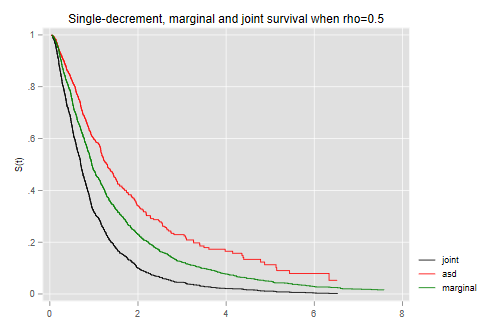
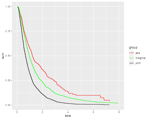
Here is a simple demostration of the difference between the marginal distribution of a failure time and and the associated single-decrement function, in a competing risks framework with two causes of failure.
We will simulate two correlated standard log-normal random
variables, with a user-supplied parameter rho. Call these
t1 and t2. The overall survival time
t is the miminum of the two. There is no
censoring.
We calculate three Kaplan-Meier estimates: the joint survival,
the marginal distribution of the (unobserved) time t1, and
the survival-like function obtained by censoring observations that fail
due to cause 2.
Here’s a Stata command an R function to simulate and plot the data:
. capture program drop simcomp

. program simcomp
  1.     args rho n
  2.     if "`n'" == "" local n 1000
  3.     clear
  4.     quietly {
  5.         set obs `n'
  6.         gen y1 = rnormal()
  7.         gen y2 = rnormal(`rho' * y1, sqrt(1-`rho'^2))
  8.         gen t1 = exp(y1)
  9.         gen t2 = exp(y2)
 10.         gen t = min(t1, t2)
 11.         gen j = (t1 < t2) + 1
 12.         stset t, fail(1)
 13.         gen tos = _t
 14.         sts gen os = s
 15.         stset t, fail(j == 1)
 16.         sts gen asd = s
 17.         gen tasf = _t
 18.         stset t1, fail(1)
 19.         sts gen ms = s
 20.         gen tms = _t
 21.     }
 22.     twoway line os tos if tos < 8, c(J) sort ///
>       || line asd tasf if tasf < 8, lc(red) c(J) sort ///
>       || line ms tms if tms < 8, lc(green) c(J) sort ///
>          title("Single-decrement, marginal and joint survival when rho=`rho'")
>  ///
>          legend(order(1 "joint" 2 "asd" 3 "marginal") )
 23. end
> simcomp <- function(rho, n=1000) {
+     meanlog = 0; sdlog = 1; tmax = 8
+     require(survival); require(dplyr); require(ggplot2)
+
+     # Simulate data
+     y1 <- rnorm(n, meanlog, sdlog)
+     y2 <- rnorm(n, meanlog + rho * (y1 - meanlog), sqrt(1 - rho^2) * sdlog )
+     t1 <- exp(y1)
+     t2 <- exp(y2)
+     t <- ifelse(t1 < t2, t1, t2)
+     j <- (t1 < t2) + 1
+
+     # Kaplan-Meiers
+     os  <- survfit(Surv(t, j > 0) ~ 1) # overall survival
+     asd <- survfit(Surv(t,  j == 1) ~ 1) # associated single decrement
+     ms  <- survfit(Surv(t1, j > 0 ) ~ 1) # marginal survival
+
+     # ggplot
+     tdf <- function(sf,name) {
+         data.frame(time=sf$time, surv=sf$surv, group=rep(name,length(sf$time)))
+     }
+     km <- filter(rbind(tdf(asd,"asd"), tdf(ms, "marginal"),
+         tdf(os,"joint")), time <= 8)
+     ggplot(km, aes(time, surv, color=group)) + geom_step() + xlim(0, 8) +
+       scale_color_manual(name="group",
+       values=c(asd="red", marginal="green",joint="black"))
+ }
And here is the result when we try rho=0.5
. simcomp 0.5

. graph export simcomp.png, width(500) replace
file simcomp.png saved as PNG format
> library(ggplot2)
> simcomp(0.5)
> ggsave("simcompr.png", width=500/72, height=400/72, dpi=72)
What would you expect if the correlation is closer to zero? Closer to
one? Try rho=0.2 and rho=0.8 to confirm your
intuition.