
We now consider models that include as predictors a continuous variable and a discrete factor, sometimes called ancova models. As usual, we read the data and group effort into categories, so we can run this unit by itself.
> library(dplyr)
> fpe <- read.table("https://grodri.github.io/datasets/effort.dat")
> fpe <- mutate(fpe, effort_g = cut(effort, breaks=c(min(effort), 5, 15, max(effort)),
+   right=FALSE, include.lowest=TRUE, labels=c("Weak","Moderate","Strong")))
Here’s the model treating social setting as a covariate with a linear effect and program effort as a factor variable with three categories
> m2cg <- lm(change ~ setting + effort_g, data=fpe)
> summary(m2cg)
Call:
lm(formula = change ~ setting + effort_g, data = fpe)

Residuals:
     Min       1Q   Median       3Q      Max
-10.0386  -2.8198   0.1036   1.3269  11.4416

Coefficients:
                 Estimate Std. Error t value Pr(>|t|)
(Intercept)       -5.9540     7.1660  -0.831    0.418
setting            0.1693     0.1056   1.604    0.128
effort_gModerate   4.1439     3.1912   1.299    0.213
effort_gStrong    19.4476     3.7293   5.215 8.51e-05 ***
---
Signif. codes:  0 '***' 0.001 '**' 0.01 '*' 0.05 '.' 0.1 ' ' 1

Residual standard error: 5.732 on 16 degrees of freedom
Multiple R-squared:  0.8016,    Adjusted R-squared:  0.7644
F-statistic: 21.55 on 3 and 16 DF,  p-value: 7.262e-06
Compare the coefficients with Table 2.23 in the notes. Countries with strong programs show steeper fertility declines, on average 19 percentage points more, than countries with weak programs and the same social setting.
To test the significance of the net effect of effort we use the
anova() function.
> anova(m2cg)Analysis of Variance Table
Response: change
Df Sum Sq Mean Sq F value Pr(>F)
setting 1 1201.08 1201.08 36.556 1.698e-05 ***
effort_g 2 923.43 461.71 14.053 0.0002999 ***
Residuals 16 525.69 32.86
---
Signif. codes: 0 '***' 0.001 '**' 0.01 '*' 0.05 '.' 0.1 ' ' 1We obtain an F-ratio of 14.1 on 2 and 16 d.f., a significant result. [The complete anova in Table 2.24 in the notes can be obtained from the model with a linear effect of setting in Section 2.4 and the present model.]{stata}
This analysis has adjusted for linear effects of setting, whereas the analysis in Section 2.7 adjusted for differences by setting grouped in three categories. As it happens, both analyses lead to similar estimates of the difference between strong and weak programs at the same level of setting.
Let us do Figure 2.5, a plot of change versus setting identifying the level of program effort corresponding to each point. I will also superimpose the three parallel lines corresponding to the fitted model.
We call fitted() to calculate fitted values, use the
levels of effort_g to label the points, left-justified with
a bit of space, and then plot the fitted regression lines for each level
of effort.
> library(ggplot2)
> fpe <- mutate(fpe, fitted=fitted(m2cg))
> png(file="fig25r.png", width=500, height=400)
> ggplot(fpe, aes(setting, change, label=effort_g)) + geom_point() +
+   geom_text(hjust="left", nudge_x=0.6, size=3) +
+   geom_line(data=group_by(fpe, effort_g), aes(setting, fitted, color=effort_g)) +
+   coord_cartesian(xlim=c(35, 95))
> dev.off()
png
2 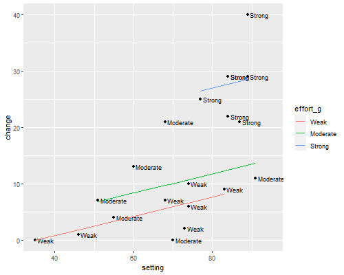
Let us turn to the comparison of adjusted and unadjusted declines in Table 2.26, a useful way to present regression results to a non-technical audience.
> b <- coef(m2cg)
> fpe <- mutate(fpe, adj_change =
+   b[1] + b[2]*72.1 + b[3]*(effort_g=="Moderate") + b[4]*(effort_g=="Strong") )
Next we tabulate our data by level of effort and summarize observed and adjusted change.
> group_by(fpe, effort_g) |>
+   summarize(observed=mean(change), adjusted=mean(adj_change))
# A tibble: 3 × 3
effort_g observed adjusted
<fct> <dbl> <dbl>
1 Weak 5 6.25
2 Moderate 9.33 10.4
3 Strong 27.9 25.7 Countries with strong program average a 28% decline in fertility, but they also tend to have higher settings; we estimate a slightly smaller decline of about 26% at average social setting. The estimate is based on the model, which adjusts linearly for setting and assumes that the slope is the same at all levels of effort. The next step will be to examine this assumption.
We will now allow the linear relationship between change and setting to vary with level of effort, by introducing an interaction between setting and the indicators of effort. Before we do that we center the index of social setting by subtracting the mean, a practice I highly recommend to simplify the interpretation of “main” effects when the model has interactions:
> fpe <- mutate(fpe, setting_c = setting - mean(setting))We can now run the regression using
> m3cg <- lm(change ~ setting_c * effort_g, data = fpe)
> summary(m3cg)
Call:
lm(formula = change ~ setting_c * effort_g, data = fpe)

Residuals:
    Min      1Q  Median      3Q     Max
-9.7364 -2.2036 -0.0549  1.8122 11.4571

Coefficients:
                           Estimate Std. Error t value Pr(>|t|)
(Intercept)                 6.35583    2.47730   2.566   0.0224 *
setting_c                   0.18357    0.13970   1.314   0.2099
effort_gModerate            3.58373    3.66235   0.979   0.3444
effort_gStrong             13.33320    8.20916   1.624   0.1266
setting_c:effort_gModerate -0.08684    0.23258  -0.373   0.7145
setting_c:effort_gStrong    0.45670    0.60392   0.756   0.4620
---
Signif. codes:  0 '***' 0.001 '**' 0.01 '*' 0.05 '.' 0.1 ' ' 1

Residual standard error: 5.959 on 14 degrees of freedom
Multiple R-squared:  0.8124,    Adjusted R-squared:  0.7454
F-statistic: 12.13 on 5 and 14 DF,  p-value: 0.0001112
> anova(m3cg)Analysis of Variance Table
Response: change
Df Sum Sq Mean Sq F value Pr(>F)
setting_c 1 1201.08 1201.08 33.8263 4.476e-05 ***
effort_g 2 923.43 461.71 13.0034 0.0006426 ***
setting_c:effort_g 2 28.59 14.30 0.4026 0.6760530
Residuals 14 497.10 35.51
---
Signif. codes: 0 '***' 0.001 '**' 0.01 '*' 0.05 '.' 0.1 ' ' 1Compare the parameter estimates with Table 2.27 in the notes. You also have all the information required to produce the hierarchical anova in Table 2.28.
Because we centered setting, the coefficients for moderate and strong programs summarize differences by effort at mean setting, rather than at setting zero (which is well outside the range of the data). Thus, fertility decline averages 13 percentage points more under strong than under weak programs in countries with average social setting.
The interaction terms can be used to compute how these differences vary as we move away from the mean. For example in countries which are ten points above the mean social setting, the strong versus weak difference is almost five percentage points more than at the mean. These differences, however, are not significant, as we can’t reject the hypothesis that the three slopes are equal.
Exercise. Plot the data and the regression lines implied by the model with an interaction between linear setting and level of effort. Note how the difference between strong and weak programs increases with social setting. The interaction is not significant, however, so we have no evidence that the lines are not in fact parallel.
Updated fall 2022