
We will start with the simplest possible model, the null model, which fits just a constant. But first we read the data again, so this script can be run independently of the previous one.
> fpe <- read.table("https://grodri.github.io/datasets/effort.dat")
> m0 <- lm(change ~ 1, data=fpe)
> m0
Call:
lm(formula = change ~ 1, data = fpe)

Coefficients:
(Intercept)
       14.3
The average fertility decline in these countries between 1965 and 1975 was 14.3%.
The first argument to lm() is a model formula,
which defines the response, followed by a tilde and a list of terms. In
this case the only term is 1, representing the constant.
The data argument specifies the data frame to be used. The
function returns a linear model (“lm”) object that we called
m0. Typing this name invokes the print()
method, which simply lists the formula and the estimated coefficients.
For more information we use the summary() method:
> summary(m0)
Call:
lm(formula = change ~ 1, data = fpe)

Residuals:
   Min     1Q Median     3Q    Max
-14.30  -8.80  -3.80   8.45  25.70

Coefficients:
            Estimate Std. Error t value Pr(>|t|)
(Intercept)   14.300      2.641   5.415 3.17e-05 ***
---
Signif. codes:  0 '***' 0.001 '**' 0.01 '*' 0.05 '.' 0.1 ' ' 1

Residual standard error: 11.81 on 19 degrees of freedom
We now get standard errors and a t-test of significance. If you want
a confidence interval just call the function confint().
If you are wondering what these statistics mean when the 20 countries at hand are not really a random sample of the countries of the world, see the discussion of model-based inference in the notes. Briefly, we view the data as a sample from the universe of all the outcomes we could have observed in these countries in the period 1965-1970.
The next step is to try a linear regression of change on setting. We
do not need to specify a constant because it is always included, unless
we use -1 to exclude it. Last time we were explicit because
the constant was the only term.
> m1 <- lm(change ~ setting, data=fpe)
> m1
Call:
lm(formula = change ~ setting, data = fpe)

Coefficients:
(Intercept)      setting
   -22.1254       0.5052
Each point in the social setting scale is associated with a fertility decline of half a percent. Compare the parameter estimates with those in table 2.3 in the lecture notes.
To obtain more detailed results we use again the
summary() function.
> summary(m1)
Call:
lm(formula = change ~ setting, data = fpe)

Residuals:
    Min      1Q  Median      3Q     Max
-13.239  -6.260   0.787   6.678  17.162

Coefficients:
            Estimate Std. Error t value Pr(>|t|)
(Intercept) -22.1254     9.6416  -2.295  0.03398 *
setting       0.5052     0.1308   3.863  0.00114 **
---
Signif. codes:  0 '***' 0.001 '**' 0.01 '*' 0.05 '.' 0.1 ' ' 1

Residual standard error: 8.973 on 18 degrees of freedom
Multiple R-squared:  0.4532,    Adjusted R-squared:  0.4228
F-statistic: 14.92 on 1 and 18 DF,  p-value: 0.001141
We can also obtain the analysis of variance in Table 2.4 using
anova()
> anova(m1)Analysis of Variance Table
Response: change
Df Sum Sq Mean Sq F value Pr(>F)
setting 1 1201.1 1201.08 14.919 0.001141 **
Residuals 18 1449.1 80.51
---
Signif. codes: 0 '***' 0.001 '**' 0.01 '*' 0.05 '.' 0.1 ' ' 1The total sum of squares of 2650.2 has been decomposed into 1201.1 that can be attributed to social setting and 1449.1 that remains unexplained.
Let us calculate the R-squared “by hand” as the ratio of the model sum of squares to the total sum of squares.
There are a number of functions that can be used to access elements
of a linear model, for example coef() returns the
coefficients, fitted() returns the fitted values, and
resid() returns the residuals, or differences between
observed and fitted values. We will add our own function to compute the
residual sum of squares.
> rss <- function(lmfit) {
+   sum(resid(lmfit)^2)
+ }
> 1 - rss(m1)/rss(m0)
[1] 0.4532026Almost half the variation in fertility decline can be expressed as a linear effect of social setting.
Let us try to reproduce Figure 2.3. We want to plot fertility change versus setting, labeling the points with the country names and superimposing the regression line.
To draw a graph we first open a graphics device, in this case
png to produce portable network graphics. We could draw
this graph using plot() for the points, text()
for the labels and abline() for the regression line, all in
base R, but we will use ggplot instead. When we add country
names we get some overprinting. A simple solution is to use a horizontal
adjustment left, so the labels come after the points,
except for Costa Rica (#5) and Trinidad-Tobago (#19), where we use
right, so the labels come before the points. We also use a
vertical adjustment of center for all, top for
Costa Rica, and bottom for Trinidad-Tobago to space these
two. We also nudge the labels a bit, so there is some space between them
and the points. Finally we extend the x-axis to leave more room for the
labels.
> png(filename = "fig23r.png", width=500, height=400)
> library(ggplot2)
> # move TrinidadTObago and CostaRica to right and vertically above and below
> hj <- rep("left",nrow(fpe));    hj[c(5,19)] <- "right"
> vj <- rep("center", nrow(fpe)); vj[5]="bottom"; vj[19]="top"
> nx <- rep(0.6, nrow(fpe));      nx[c(5,19)] <- -0.6
> ggplot(fpe, aes(setting, change, label=rownames(fpe))) +
+   geom_point() + geom_text(hjust=hj,vjust=vj, nudge_x=nx, size=3) +
+   geom_smooth(method="lm") + coord_cartesian(xlim=c(35, 100)) +
+   ggtitle("Figure 2.3: Fertility Change by Social Setting")
`geom_smooth()` using formula 'y ~ x'> dev.off()png
2 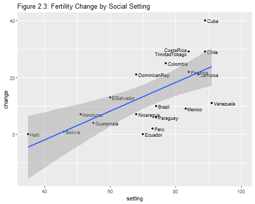
Note: The plot() method for linear model fits
produces four plots: residuals versus fitted values, a Q-Q plot for
normality, a scale-location plot, and a plot of residuals versus
leverages. We will learn about these statistics in Section 2.9. If you are curious try typing
par(mfrow=c(2,2)) and plot(m1). The first call
changes the graphics device layout to show four plots in two rows and
two columns. When you are done type par(mfrow=c(1,1) to
restore the default.
Exercise: Run the simple linear regression model for fertility change as a function of program effort and plot the results.
Updated fall 2022