
We start with the linear models in Chapter 2 of the lecture notes,
showing how to use the regress command in Stata to fit
regression, analysis of variance, and analysis of covariance models.
For a brief description of the program effort data see the lecture notes or point your browser to the datasets page. All datasets used in the course are in plain text format, and they are also available as Stata system files. Both formats can be read directly from the web.
. use https://grodri.github.io/datasets/effort, clear
(Family Planning Effort Data)
Let us list the data to check that we got them OK.
. list country setting effort change, clean

              country   setting   effort   change
  1.          Bolivia        46        0        1
  2.           Brazil        74        0       10
  3.            Chile        89       16       29
  4.         Colombia        77       16       25
  5.        CostaRica        84       21       29
  6.             Cuba        89       15       40
  7.     DominicanRep        68       14       21
  8.          Ecuador        70        6        0
  9.       ElSalvador        60       13       13
 10.        Guatemala        55        9        4
 11.            Haiti        35        3        0
 12.         Honduras        51        7        7
 13.          Jamaica        87       23       21
 14.           Mexico        83        4        9
 15.        Nicaragua        68        0        7
 16.           Panama        84       19       22
 17.         Paraguay        74        3        6
 18.             Peru        73        0        2
 19.   TrinidadTobago        84       15       29
 20.        Venezuela        91        7       11
As you can see, we have 20 observations on three variables: social
setting, family planning effort, and fertility
change.
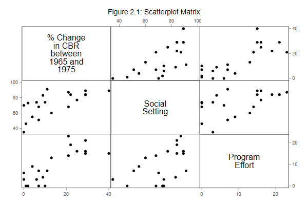
The next thing we want to do is plot the data for a closer look. The importance of becoming familiar with your data before undertaking sophisticated analyses cannot be over-emphasized. Let us create scatterplots of all pairs of variables, reproducing Figure 2.1 in the notes.
. graph matrix change setting effort, ///
>   title("Figure 2.1: Scatterplot Matrix")

. graph export fig21.png, width(600) replace
file fig21.png saved as PNG format
After generating the graph you can print it using the command
graph print, save it in Stata’s own format using
graph save, or export it into other formats using
grap export. I exported the graph to portable
network graphics (PNG) format for inclusion on this web
page. Word users may be better off exporting to windows
metafile format (WMF) or the enhanced variant (EMF). LaTeX
users may prefer to save directly into PDF format.
Your graph may look slightly different than mine, depending on the
scheme you use. The Stata default is called
s2color, but these logs use plottig. Type
help scheme if you are interested in this subject.
Updated fall 2022